Users research
Here's a summary of what I learned from my contextual analysis and qualitative interviews. I spoke to five users that love reading and were interested in book clubs.

Booknook was born from two sentiments: that ideas are meant to be shared, and that reading demands willpower. This app aims to be a social space where the joy of discovering a book turns into a collective experience.
(also, I'm a nerd that loves books)

Here's a summary of what I learned from my contextual analysis and qualitative interviews. I spoke to five users that love reading and were interested in book clubs.
1. Finding motivation to read more.
2. Finding people with similar interests.
3. Enriching their reading experience.
1. Their friends don't read the same books.
2. Not having anyone to share thoughts with.
3. Decreased interest in reading.

1. Find any book and add it to your reading list.
2. Most apps offer event creation and meetings.
3. Personalized reading recommendations.
1. Apps don't actively tackle the motivation problem.
2. A huge amount of abandoned book clubs.
3. Finding a book and joining a club are two disconnected functions.

I tried different approaches to solve each issue. I made lots of sketches and worked with low-fidelity wireframes until I developed a system that works effectively.
I decided to replace traditional book clubs with engaging reading challenges. This small change solved most of the difficulties I found in the market research.
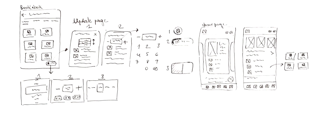
I tested the application with five users. They mostly succeeded in the tasks given without significant help, but showed signs of hesitation and confusion at times.
Problem
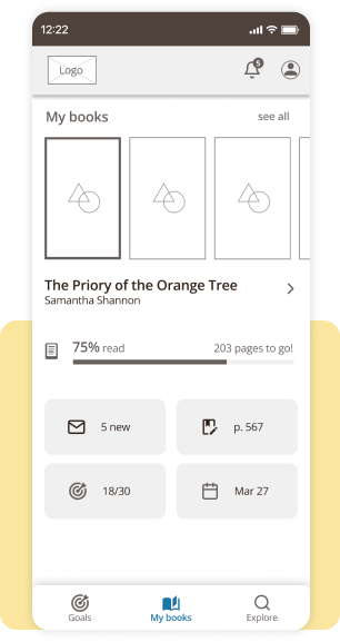
Users expressed confusion and felt slightly overwhelmed due to the abundance of information and functions on the homepage.
Solution
I simplified the homepage by merging redundant options and presenting information in a cleaner format.
Before

After
Problem
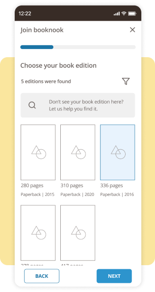
Some of the steps while joining a club were found to be tiresome, such as having to check the number of pages in the book they were reading.
Solution
I revised each screen to ensure they instilled a sense of meaningful engagement. Instead of requiring users to manually input the number of pages, the user chooses his edition by its cover.
Before

After
While working on the app's user interface, I aimed for a nostalgic and inviting retro style that would resonate with book lovers, evoking a sense of warmth and familiarity.


Each book has its own "nook", a social space where users can share their thoughts and reading goals. To join one:
1. The user searches for the book they are currently reading.
2. Input their reading platform and progress to stay away from spoilers.
3. Join a group challenge if they want to.
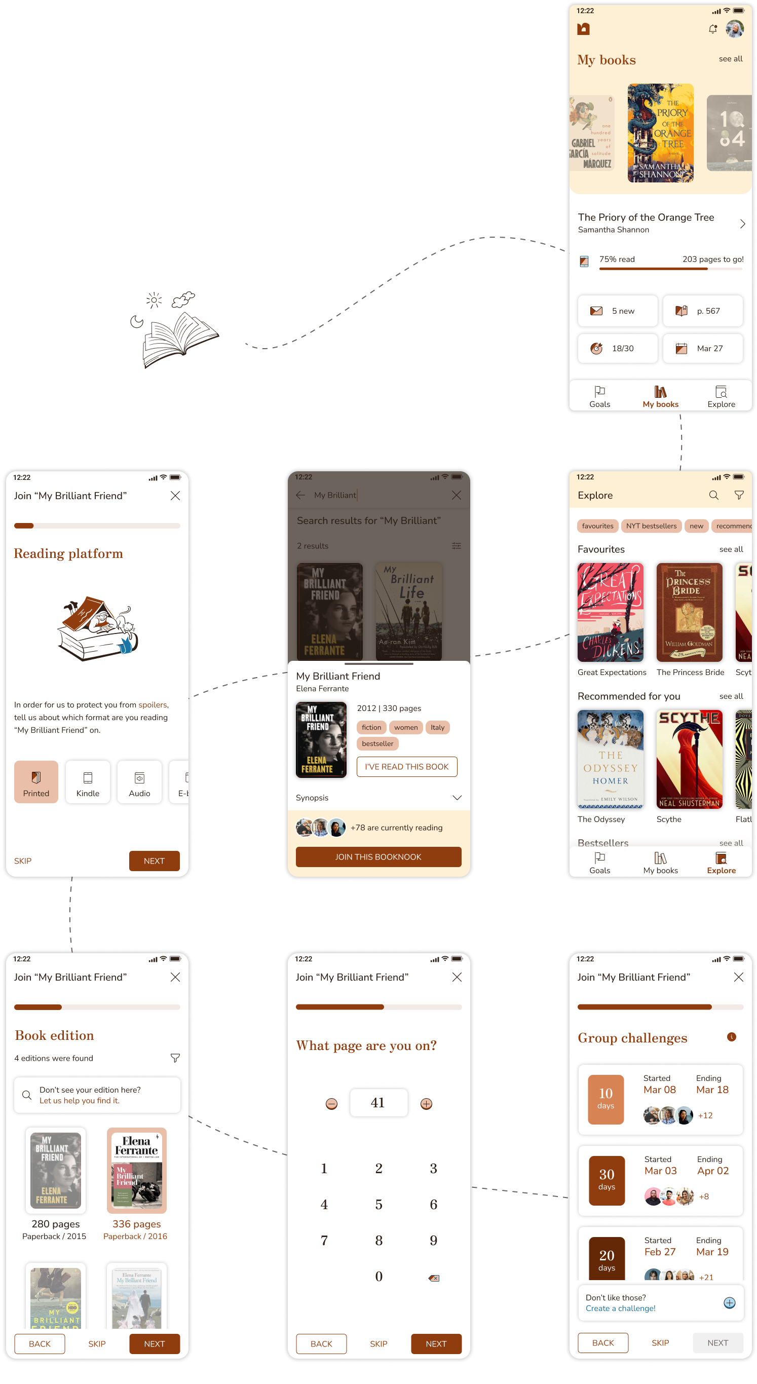

As users make progress in their reading journey, they can update their status and share their achievements with friends. Kindle users also have the option to sync their applications for convenience.
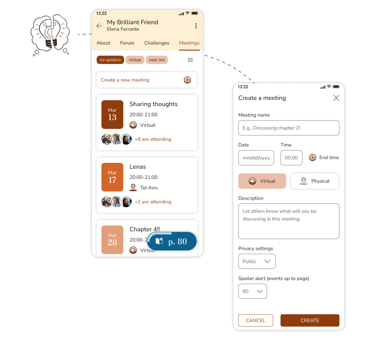
The app facilitates the creation and participation in meetings, whether they are virtual gatherings or held at a specific physical location.
