
Goals
1. Accessing useful information about ideal cars easily.
2. Understanding the distinctions between relevant cars.
Wheel Wizard started as a four-person group project in Codesigner UX course. Following our own experience, we wanted to create an app accessible to users with no expertise in automobiles.
Team: Kim Selmanovich, Natali Evron, Tal Gavish and Albert Bercovici
“I found myself wanting to collaborate on more group projects together." - Kim
"It was an incredibly enriching and educational experience. We learned a lot from each other." - Natali
Here's a summary of what we learned from our contextual analysis and qualitative interviews. We spoke to users who don't know much about cars but depend on them for their daily lives.
1. Accessing useful information about ideal cars easily.
2. Understanding the distinctions between relevant cars.
1. Choosing the right car can be a daunting task.
2. Lack of ability to compare different cars.
3. Not all salespersons can be trusted.
By working as a team, we achieved conclusions that were less subjective. We also gained a deeper understanding of common problems than we would individually. Those are the products we analyzed:

1. Informative car comparisons.
2. Results well-organized hierarchily.
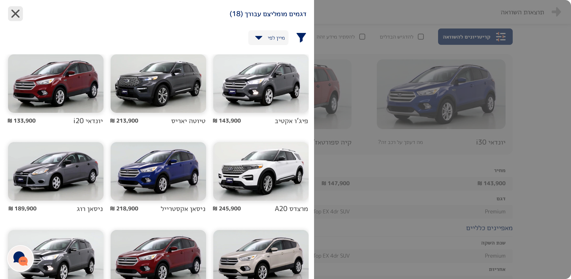
3. Edmunds offers comparison suggestions.
1. Excessive technical details.
2. Comparison results lack interactivity.
3. Limited to users who already know the specific cars they want to compare.
We collaborated on brainstorming multiple approaches to tackle each problem. We extensively sketched and worked with low-fidelity wireframes, sharing ideas the whole time.
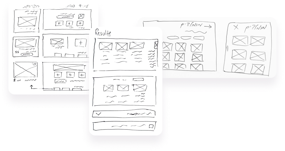
We worked on the same Figma file, using the same styles and components and always commenting on each other screens.
We tested the application with a few users. They mostly succeeded in the tasks given without significant help, but showed signs of confusion and even frustration at times. Here's a summary of the main problems we detected and how we solved them.
Problem
Some users felt overwhelmed by the amount of information presented.
Solution
We prioritized the most crucial information and worked on erasing redundant functions.
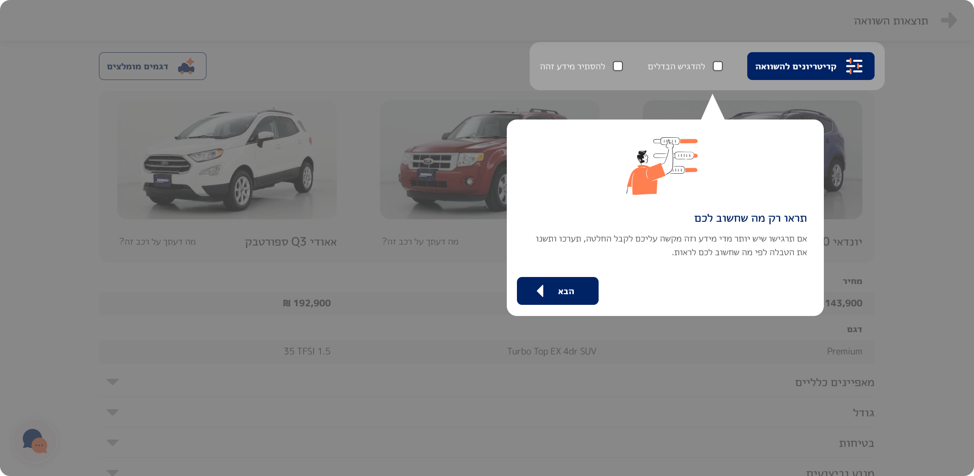
Problem
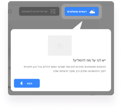
Users had limited access to their recommendations while working on their comparison table.
A pop-up would appear in certain cases linking the user to his recommendations.
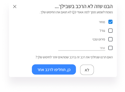
Solution
We streamlined the process for users to access their recommendations and introduced an onboarding screen to highlight this functionality.
*I worked independently on the UI aspect as the group project primarily focused on the UX.
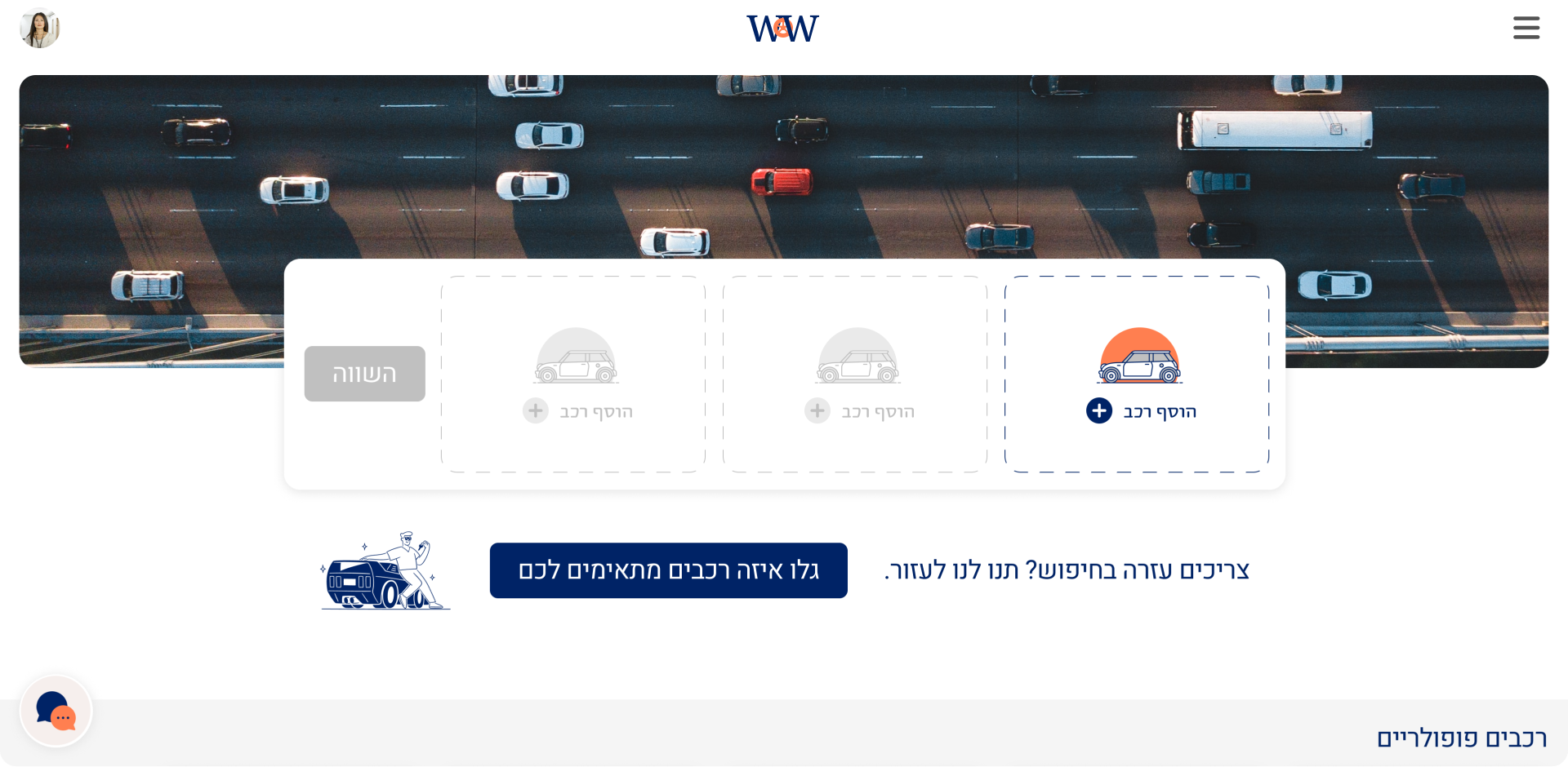
The homepage showcases the two main features of the application:
1. Comparisons between different cars.
2. A guided search option.


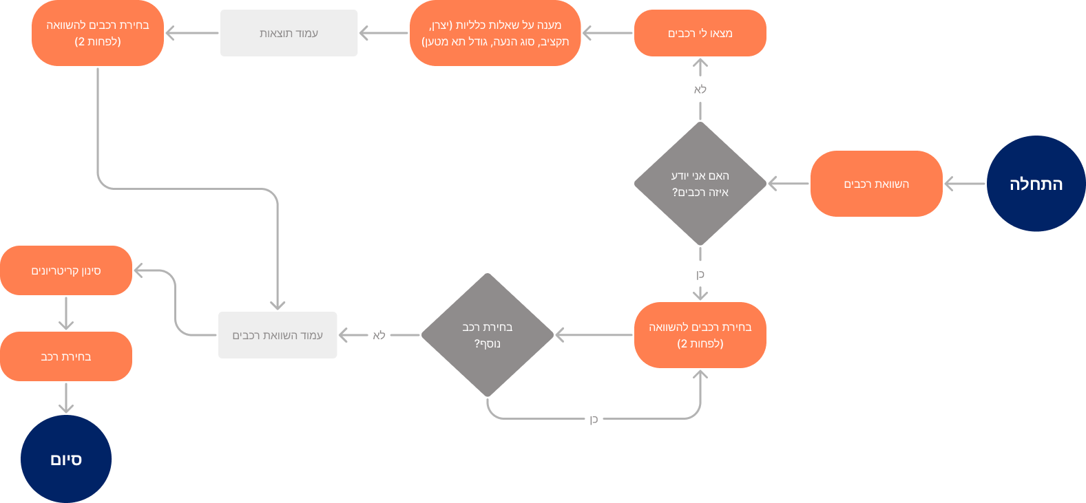
Users seeking assistance in finding the perfect car are led through an intuitive wizard that elevates seemingly simple questions into meaningful ones.
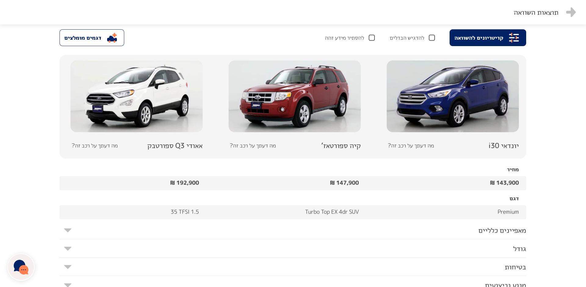
We ensured an interactive table, and aimed for a dynamic experience, enabling users to generate new comparisons seamlessly without leaving the screen.

